
Wayther
A weather app designed for the person who wakes up in one city and lands in another by Thursday.
The Problem
Today's weather apps are built for someone who stays put.
One location, one region. But the people who actually need weather data — the ones with 6am flights, back-to-back meetings across continents, and a suitcase that needs to work in Vancouver and Tokyo in the same week — those people are constantly patching together information across three different apps and a Google search just to answer one question: what do I pack?
Wayther was designed to eliminate that cognitive overhead entirely!
The Users
Two audiences, different cadences.
The primary user is a frequent traveler. They're managing time zone math in their head before their first coffee. They need to know what's happening in three cities simultaneously — not sequentially, but at a glance.
The secondary user is a long-term planner — a farmer, an outdoor coordinator, someone whose livelihood depends not on today's weather but on whether the next three weeks look dry enough to harvest. Their needs are different in cadence but identical in stakes. The design had to serve both without compromising either.
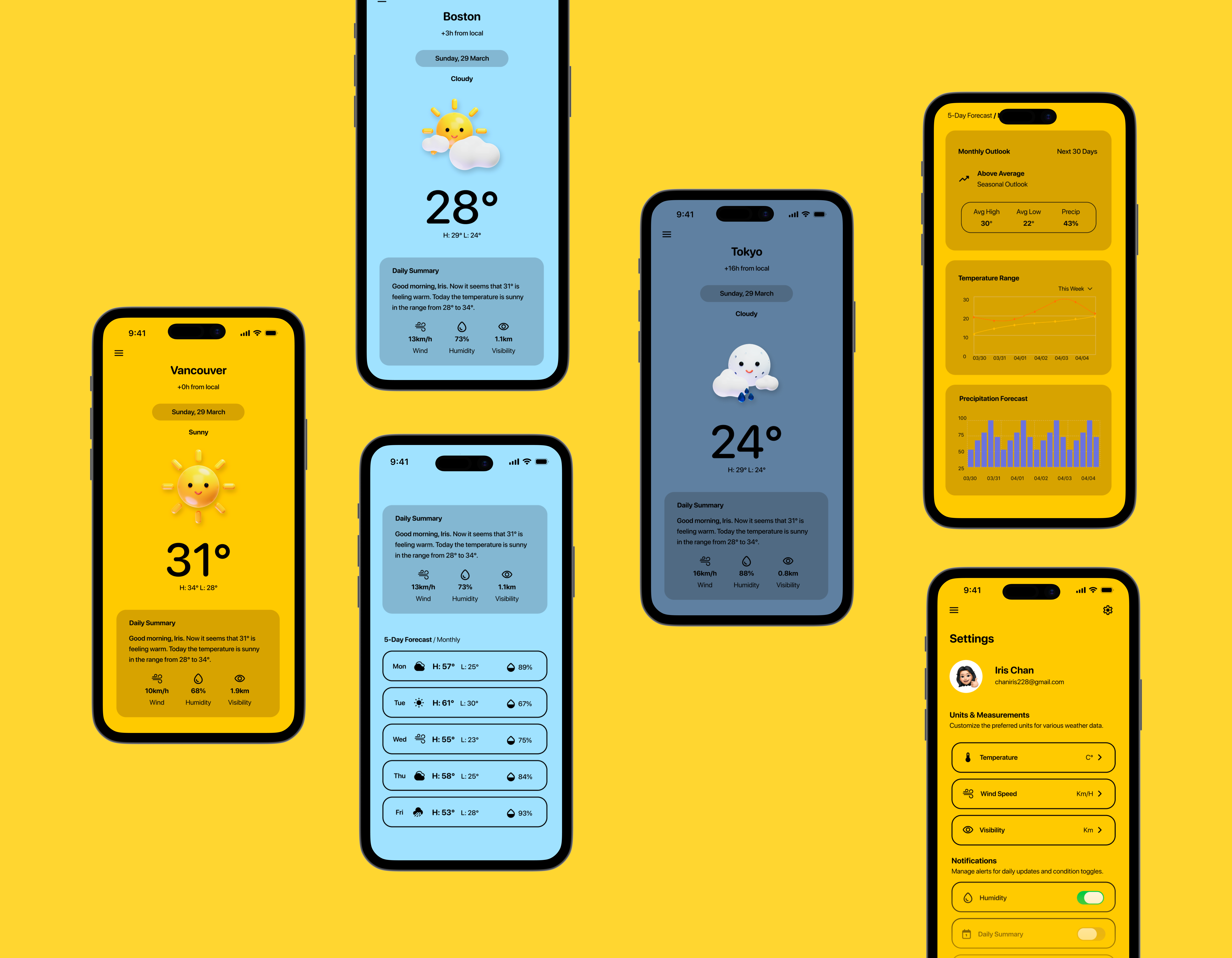
The Color System
Orient before you read.
The first thing you notice in Wayther is that each city feels different. Vancouver is warm yellow — sunny, immediate. Boston is a cool sky blue — overcast, distant. Tokyo is a muted slate — nighttime, arriving soon. It's such a simple but overlooked detail in design that speaks so much.
A traveler context-switching between cities shouldn't have to read to orient. The color tells them where they are before their eyes settle on a single word. Combined with the time zone offset displayed directly under the city name — +3h from local, +16h from local — the app eliminates the most friction-heavy part of the traveler's daily routine.
Design System
Colour, type, and the decisions behind them.
Primary colours
Secondary colours
Typography
SF Pro Rounded / Nunito · Display
UI / Body
The 5-Day Forecast
Deliberate prioritization.
A traveler doesn't need a wall of data and statistics like the 'pressure' on Friday. They need three things — what day, what condition, what's the temperature range. Each forecast row leads with exactly that. Hourly breakdowns exist and have their place, but for someone managing flights and meetings across time zones, granular hourly data adds cognitive load without adding meaningful value. That was a deliberate tradeoff.
The 5-day strip answers the only question that actually matters to the person packing a bag on a Tuesday night: what do I wear in Tokyo on Thursday?
The Monthly View
Same screen, different user.
Tapping "Monthly" doesn't take you somewhere new — it transforms the screen you're already on. For the long-term planner, the temperature range chart maps daily highs and lows across the coming weeks. Not a single number, but a trend — because a farmer doesn't want to know if it's cold today, they want to know if the next ten days are consistently cold enough to matter. The precipitation forecast shows rainfall probability day by day, surfacing the dry windows that outdoor work depends on.
What Wayther Is Really About
Weather data is the same everywhere.
What differentiates an app is how well it understands its user. Every decision in Wayther — the color system, the forecast format, the timezone offset, the monthly toggle, the humidity row — traces back to a specific person with a specific problem. The traveler who wakes up in Vancouver, takes a 9am call in Boston, and lands in Tokyo by Thursday.
Designing for that person, specifically and without compromise, is the only goal that ever mattered :)
Reflection
So, what did I learn?
Wayther started as an assessment brief and became something I genuinely cared about finishing well. Designing for two users with completely different needs — a traveler who thinks in hours and a farmer who thinks in seasons — pushed me to be more deliberate about every decision. Features that served one user without hurting the other weren't a given. They had to be designed for.
The colour-per-city system was the decision I'm most proud of. It started as a visual idea and became a wayfinding system — something that does real work before the user reads a single word. That shift in thinking, from "does this look good" to "does this reduce effort", is probably the most useful thing this project taught me.
If I were to continue, I'd want to test the monthly view with actual long-term planners — farmers, event coordinators, outdoor guides. My secondary user is well-defined on paper, but assumptions about what a farmer actually needs from a weather app deserve to be challenged by someone who's walked the fields.
Next Project
LumiRoom →