
LumiRoom
Express freely. Explore deeply.
Interactive Presentation — click through the slides
The Problem
Social media wasn't built for honest self-expression.
Students want to express their identities and explore new passions — but the platforms they use make this harder than it should be. Fear of judgment, constant comparison, and the pressure to maintain a curated online persona all get in the way. Overwhelmed by algorithmic content and lacking a space for genuine sharing, students struggle to discover what actually inspires them.
The problem isn't that students don't want to share. It's that every platform they have gives them a reason not to.
The User
Meet Emily.
Emily is 20, a third-year Psychology student with a genuine curiosity about creativity, poetry, and gardening. She loves exploring new interests but feels overwhelmed by social media and discouraged by the unrealistic standards it surfaces. She cares about self-growth but rarely shares her real thoughts online — fear of judgment and comparison keeps her in a safe, performative lane.
She doesn't need another platform. She needs a different kind of space.
Fear of judgement
Emily holds back her real interests online because she's afraid others will judge or misunderstand her.
"Perfect" social media
Platforms push her into a safe persona — only posting what seems acceptable or impressive.
Difficulty finding real inspiration
Most content she sees is algorithmic or performance-based, not genuine or relevant to her actual interests.
The Solution
LumiRoom — a space designed for growth, not performance.
LumiRoom is a safe digital space where students can share their thoughts and growth journeys, connect with like-minded peers, and find inspiration through authentic ideas — not algorithmic ones.
The goal wasn't to build another social app. It was to build the opposite of one.
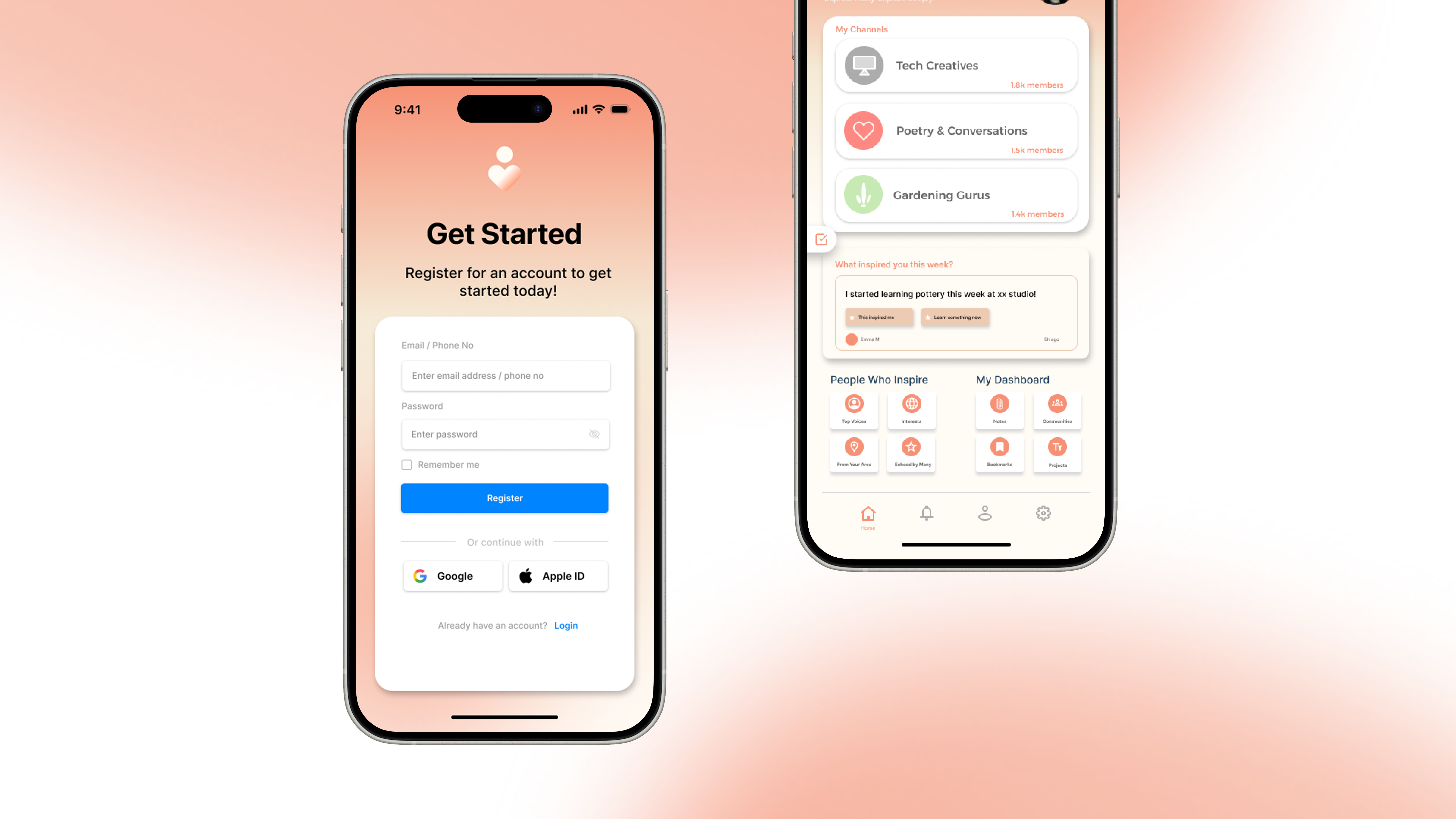
Channels
Users join channels built around their real interests — Tech Creatives, Poetry & Conversations, Gardening Gurus. Niche enough to feel like a community, not a feed.
User Check-Ins
The app prompts users daily with a simple question: something nice they did, something new they learned. A habit of reflection rather than performance.
Authentic Engagement
Likes are replaced with intentional reactions — "This inspired me" and "I learned something new." Removing the quantifiable metric removes the incentive to perform.
Design Decisions
Every visual choice has an emotional intention.
The warm coral-to-white gradient was deliberate — it needed to feel soft and approachable, distinct from the cold whites and high-contrast surfaces of mainstream social platforms. The palette signals safety before a user reads a word.
Typography and contrast were areas I pushed myself on throughout. Early iterations had hierarchy issues — headings and body text competing rather than guiding the eye. Iterating on font weight, size relationships, and colour contrast taught me how much a few deliberate type decisions can change how information lands.
The reaction system was the most considered feature. Replacing likes with “This inspired me” isn't just a copy change — it's a fundamental shift in what the platform rewards. Every time a user reacts, they're making an intentional statement rather than a reflexive tap. That distinction shapes behaviour over time.
Reflection
So, what did I learn?
LumiRoom taught me that the quality of your design solution is bounded by the clarity of your problem definition. The three pain points — judgment, comparison, irrelevant content — gave every decision a test. Does this feature reduce judgment? Does this interaction remove comparison? If it didn't pass, it didn't belong.
I also learned that foundational decisions compound. Contrast, type choice, spacing — these aren't finishing touches, they're structural. Getting them right early makes everything easier. Getting them wrong means every subsequent decision is fighting the layout instead of serving the user.
If I were to continue, I'd want to test whether the check-in habit actually sticks — whether daily prompts feel meaningful after a week, or start to feel like another notification to dismiss. That's the question the prototype can't answer. It needs real users and real time.
Next Project
Backtest Performance Dashboard →