
Backtest Performance Dashboard
Translating quantitative trading outputs into decisions, not just data.
Overview
The right data. The wrong hierarchy.
The UBC Trading Group's quant team — 8+ quant researchers — runs algorithmic backtests to evaluate portfolio strategies. But the outputs were landing in a dashboard that made the data hard to act on. Numbers existed. Meaning didn't.
This project was an end-to-end redesign: from user research with the quant researchers, to information architecture, to high-fidelity Figma prototypes. The goal wasn't to add more data — it was to make the existing data actually communicate.
The Problem
Accurate, but not useful.
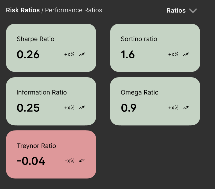
Risk ratios sat without context — no indication of what a “good” Sharpe ratio looks like, no comparison to a benchmark, no sense of whether 0.26 is something to celebrate or worry about.
The asset allocation table listed weights as decimals in a column with no visual weight — meaning a researcher had to mentally convert, compare, and rank every row themselves. The portfolio performance chart used red for the S&P 500 benchmark, a colour the entire finance world associates with loss, creating a false signal before you'd read a single number.
The dashboard was accurate. It just wasn't doing any of the interpretive work that would make it useful under pressure.
Research & Architecture
Mapping the actual decision workflow.
I started by sitting with the quant researchers and mapping their workflow — not what the dashboard showed, but what decisions they were actually trying to make with it.
That surfaced a clear hierarchy the original layout had ignored: T1 — Performance: How is the portfolio doing? Against itself, against the benchmark, over time. T2 — Asset Allocation: What's driving performance? Which assets carry the most weight? T3 — Risk: What's the downside exposure? Expected shortfall, volatility. T4 — Details: Granular numbers — monthly breakdowns, individual asset returns.
The redesign reorganised the entire dashboard around this hierarchy. What researchers needed first was now visually first.
Portfolio Performance
Colour should signal meaning, not just differentiate.
Kept the line chart — it's the right format for time-series data, and familiarity matters in analytical tools. The key change: replaced red for the S&P 500 benchmark line with a muted neutral colour. Red in finance means loss. Using it for a benchmark comparison was creating a false negative signal that had nothing to do with actual performance.
Added a gradient fill beneath the portfolio line for visual weight, and period filtering — monthly, quarterly, 6-month, 1-year — so researchers can zoom into the timeframe relevant to the strategy being evaluated.
Risk Ratios
Colour differentiation by scale, not by sign.
The original panel used a flat layout with no visual hierarchy. Sharpe ratio was buried mid-grid. Colour was applied generically. The redesign moves Sharpe to prominence and colours each ratio relative to its own meaningful threshold — not just positive/negative.
Hover interactions now expose the formula behind each ratio — so a researcher doesn't have to hold the definition in their head while reading the number.
Updated statistics panel showing annotated metrics.
Design Decisions
Every change has a reason.
Asset Allocation Table
Visual weight should match analytical weight.
The original table listed weights as decimals in plain text with no visual representation of relative size. A researcher looking at TSLA: 1.00, MSFT: 0.75, IBM: 0.00 has to do the comparison mentally across every row.
The redesign adds inline weighted bars — a proportional horizontal bar next to each asset so relative weight is immediately visible. Decimals converted to percentages. Assets sorted by weight descending so the most impactful positions are always at the top. Returns colour-coded green for positive, red for negative — applied to the number itself, not the row background, keeping the table readable.
Column dividers removed entirely. They were adding visual noise without adding information.
Asset Allocation Chart
Remove clutter. Surface the signal.
The donut chart previously had text labels inside the donut itself — creating a cramped, hard-to-read centre. Labels moved to a clean side legend. The chart area was resized relative to the table to better balance the panel.
Negative expected shortfall values are now highlighted red, positive values green — making the risk signal instant rather than requiring the researcher to parse the sign of the number. The balance button received a distinct highlighted background to visually separate it from the shortfall figure it was previously blending into.
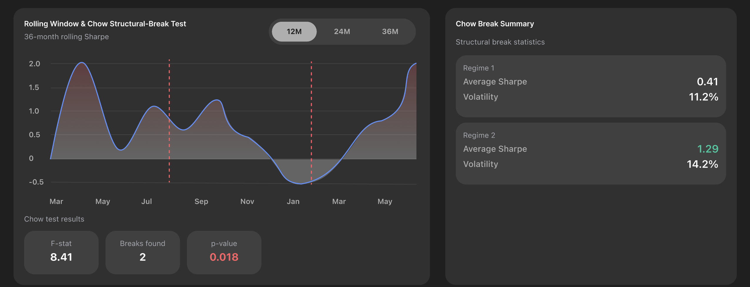
Heatmap Addition
A view the original dashboard didn't have.
A cross-correlation heatmap was added as a supplementary view — showing lag relationships between portfolio metrics. Darker green indicates positive correlation, darker red indicates negative. For quant researchers evaluating strategy robustness, this surfaces structural patterns that a performance line chart alone can't show.
Reflection
So, what did I learn?
Designing for data-heavy interfaces taught me that clarity is not about simplification — it's about making the right things effortless to understand. The biggest shift in my thinking was realising that every element on a dashboard is either doing interpretive work for the user, or quietly making them do it themselves.
Colour that just differentiates isn't doing enough. Hierarchy that follows data structure instead of decision-making flow isn't serving anyone. And visual weight that doesn't match analytical weight — where a 75% portfolio allocation looks the same as a 5% one — is a design failure hiding behind neutrality.
Working closely with the quant team also reinforced how much domain knowledge matters in UX. I couldn't have made these decisions without understanding what a Sharpe ratio actually means, or why a researcher reaches for it before anything else. The research process wasn't just discovery — it was the foundation every visual decision was built on.
If I could go back, I'd push earlier for a proper usability test with the researchers mid-prototype. Intuition got me far, but structured feedback would have surfaced friction I didn't catch until later. That's the habit I'm carrying into every project from here.
Next Project
Wayther →